Grain Studios: Strangely Drawn
A stranger draws you. By hand. No AI, no filters, no generation — a real person picks your selfie from a public pool, redraws it on a blank canvas with real brushes, and the drawing comes back to you. The proof is the timelapse: every stroke captured and replayed.
- Role
- Designer & Developer
- Platform
- iOS, iPadOS
- Industry
- Social & Creative
- Focus
- Product Design & Visual Identity
Project Overview
Strangely Drawn is a social drawing app built on a single refusal: no generative AI anywhere in the loop. You submit a selfie to a public pool. A stranger — anonymous, no profile — picks it, gets a blank canvas and real brushes, and redraws you by hand. When they finish, the drawing comes back to you and goes into a public gallery. Any phone can generate a convincing portrait on demand, so an image of your face is no longer the scarce thing. The scarce thing is knowing a real person sat with it and made something.
Every drawing is captured stroke by stroke — position, pressure, tilt, timestamp — stored separately from the finished picture. That stream replays as a timelapse, and it is also the receipt. A generated image has no strokes to replay. If you can watch it being drawn, a hand drew it.
The drawing engine is written from scratch in Metal instead of Apple's PencilKit. PencilKit's ink types are a closed list — you cannot add your own, a dead end the moment you want a real brush kit. The cost is that pressure and tilt don't exist in the Simulator; tuning happened on a physical iPad Air with an Apple Pencil Pro until it stopped feeling like a toy.
Key Features
- →Custom Metal drawing engine with pressure and tilt sensitivity — built from scratch because PencilKit's closed ink set couldn't support a real brush kit
- →Stroke-by-stroke timelapse capture and replay — the provenance system that proves a human drew it
- →Stranger-to-stranger delivery loop — submit a selfie, draw a stranger, receive your drawing back
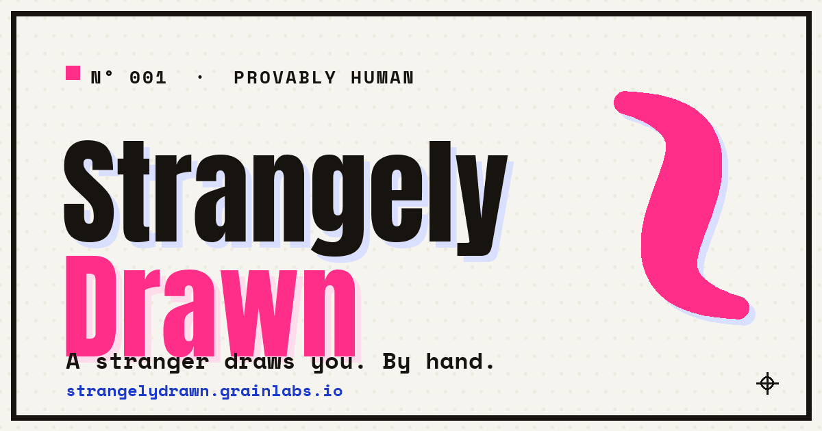
- →Riso Zine visual identity — two fluorescent inks (hot pink #FF2E88, hard blue #1536C9) on paper, zero corner radii, hard keylines, deliberately misregistered wordmark
- →Content moderation gate for the public selfie pool — built and running before the first public user
- →Fully native SwiftUI with a Metal rendering layer — no React Native, no cross-platform, no shortcuts
Design Approach
The app worked before it looked like anything. The canvas drew, the brushes felt right, the gallery filled up. And then I actually looked at it: warm cream, blurred floating chips, everything rounded and centered and softly shadowed. It looked like nothing. The whole pitch is that a real person sat down and made something by hand — and its own surface looked like no one had made a single decision.
So before I touched a view, I wrote a kill list — the tells I was deleting on sight. Warm cream #F4F1EA. Earthy accents. UltraThinMaterial blur. Soft shadows. Everything rounded. What replaced it is a system called Riso Zine: a two-color risograph look — bright stock paper #F6F4EE, near-black ink #17130F, hot pink and hard blue. Anton and Space Mono for type, bundled with open-font licenses. Corner radius zero everywhere, hard ink keylines, no blur, no shadow.
A zine gets exactly one thing that shouts — the deliberately misregistered wordmark — and the discipline is everything you refuse to let compete with it. Every other panel stays calm and hard-edged, so the one crooked thing reads as a decision instead of a defect. State changes snap instead of the springy bounce every template ships with. A submitted selfie stamps into the pool with a single-frame offset, the way a press lands.
Pink is the entire identity, and pink is barred from carrying a single word. On paper it lands at roughly 2.5:1 contrast — nowhere near legible — so every real sentence is set in plain ink. The loudest thing in the design is disqualified from the one job text depends on.
The redesign broke a drawing and a test caught it. Changing how the tool panel collapsed — from a slide to a fade — left the panel on screen a beat too long, swallowing the first stroke. A test expecting two strokes kept returning one. I put the slide back. That's the real lesson of a restyle: the animation you swapped because it looked cleaner is now eating the thing the user actually came to make.
Design Screens
Outcome
The redesign shipped as three pull requests, all merged the same day, with thirty-three unit tests and ten UI tests staying green the whole way. The last twenty percent — halftone grain, kerning, exact misregistration — is reserved for finishing by eye. That reservation is the thesis in a footnote: an app that asks a stranger to make something by hand had no business looking like nobody made it at all.